


Overview
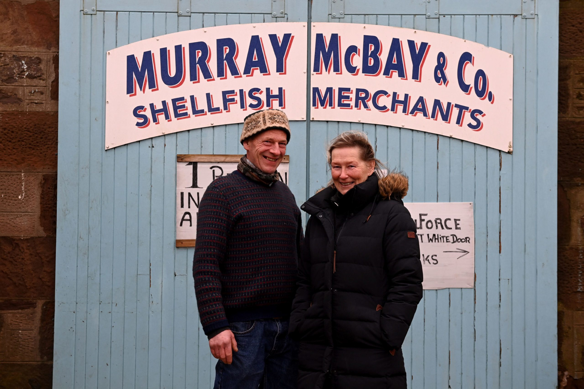
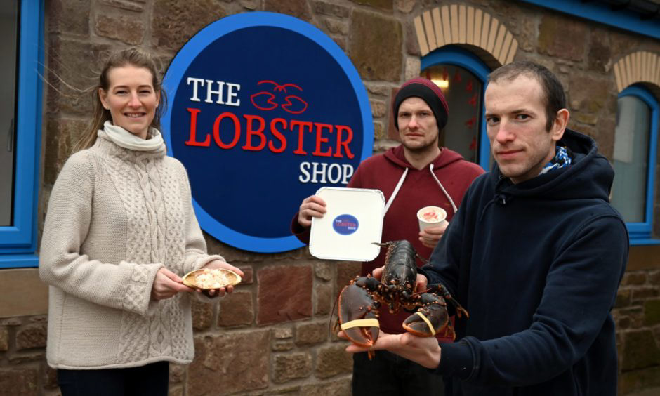
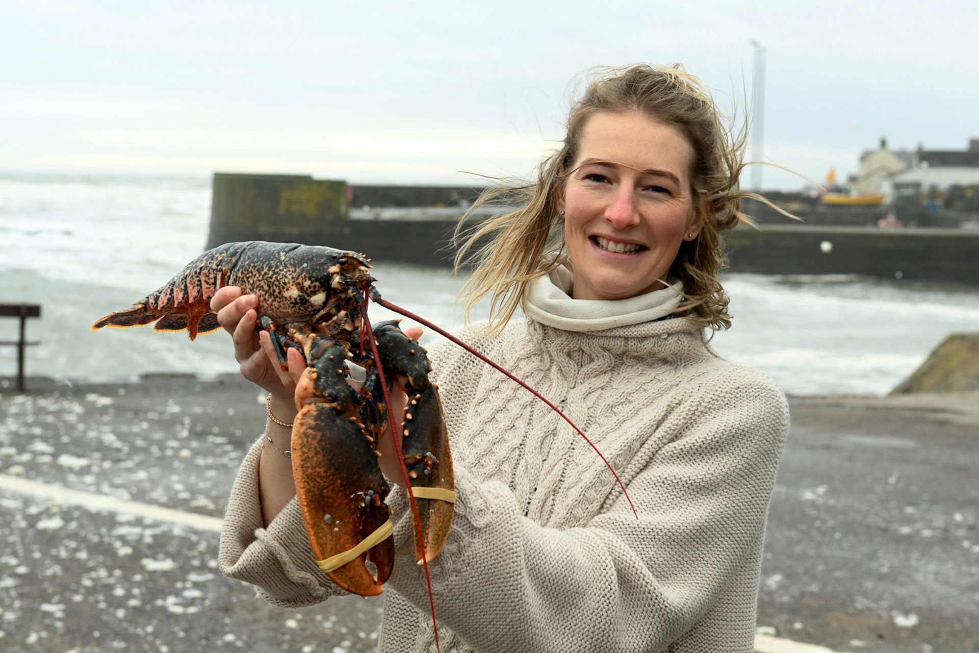
For three generations, Murray McBay & Co has supplied the finest live lobsters to restaurants throughout Europe. In 2020, the business decided to expand into selling cooked/prepared shellfish products via an on-site retail space and ‘The Lobster Shop’ was born.
We have worked with Murray McBay & Co closely throughout this project, helping to build a new brand identity encompassing both the parent brand and this new venture, articulating the relationship between them, and communicating key messages about the businesses and their products. Product-related messages for the new branding included quality, simplicity, freshness, and flavour. For the retail market, it was felt that the branding should reassure customers of both affordability and ease of preparation.
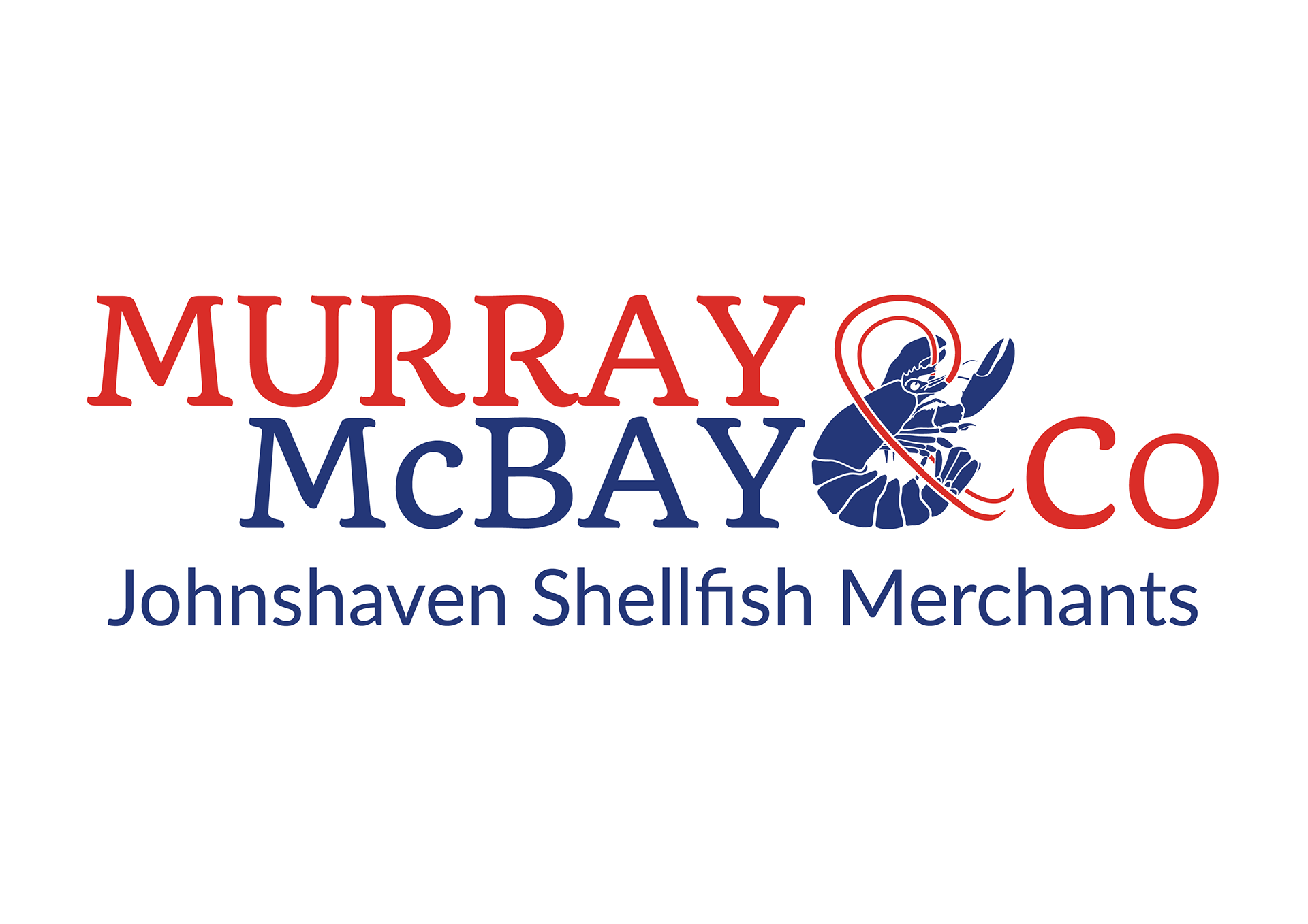
When cooked, lobsters undergo a colour change from blue to red, providing the basis of a nautical colour palette and a means of differentiating the product ranges of the two operations. The Murray McBay & Co logotype uses a stylised blue lobster ampersand to reinforce its identity as a live product wholesaler. For The Lobster Shop, both the logo and the ‘LOBSTER’ logotype are red, communicating that the products are cooked/prepared rather than live. In addition, the inversion of blue and white between the logotypes further distinguishes the retail space from the wholesale operation.
Despite these distinctions, the connection between the businesses is conveyed via a single colour palette and the shared use of a clean, impactful font to evoke simplicity and quality. These shared elements aid customer understanding of the business narrative and facilitate the transfer of existing positive associations to this new venture.
Since launching in early 2021, The Lobster Shop has gone from strength to strength, and it has been a pleasure working with Murray McBay & Co to support this exciting expansion in their offering to customers.